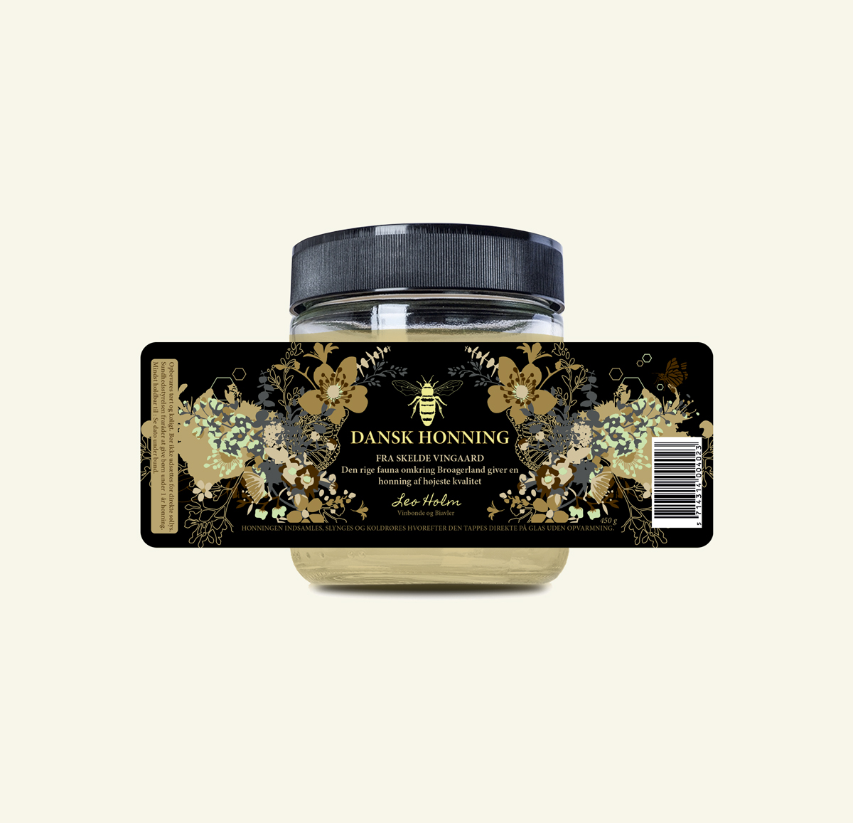
Label design Skelde Vinyard
De ville gerne bruge farver der harmonerede sammen med honningen men samtidig ydede en kontrast, så deres nye udtryk ville distancere sig fra de allerede eksisterende og konkurrende designs der findes på markedet.
En af kendetegnene for disse er det lyse beige/brune bund farvevalg, samt masser af bikuber og bier. Derfor valgte vi at arbejde med en sort kontrast som baggrund. Vi ville visuelt tilbage til rødderne og vise det som er kernen og så karakterisktisk i honningen, nemlig den fauna der indsamles af bierne.
Netop fordi det er en lille honning producent var det vigtig med det personlige touch så derfor fremhæver vi området hvor bierne samler pollen samt vi har en signatur af gårdejeren.
–
They wanted to use colors that harmonized with the honey but at the same time provided a contrast, so that their new expression would distance itself from the already existing and competing designs available on the market.
One of the characteristics of these is the light beige / brown background color choice, as well as lots of beehives and bees. Therefore, we chose to work with a black contrast as a background. We wanted to visually return to the roots and show what is the core and a characteristic of the honey, namely the fauna collected by the bees.
Because it is a small honey producer, the personal touch was important, so we highlighted the area where the bees collect pollen and we have a handwritten signature of the farm owner.