Campaign artwork for Århundredets Festival
Festivalen samler videnskabsfolk, kunstnere, institutioner og kreative entusiaster og fusionerer dem gennem koncerter, middage, foredrag, forfatterlæsningsfilm og udstillinger.
Festivalen er fokuseret på viden, men altid med den kulturelle oplevelse som krydderi.
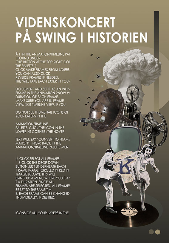
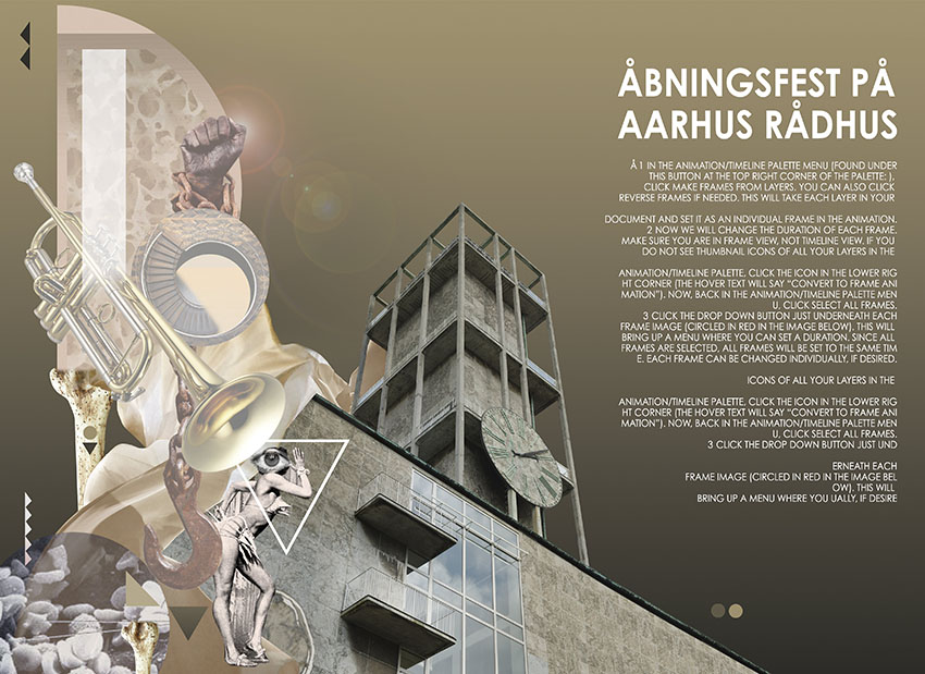
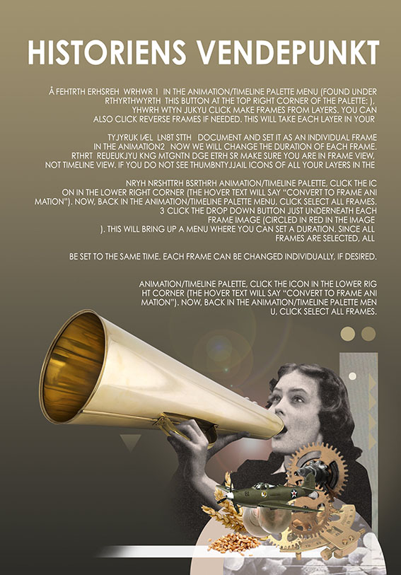
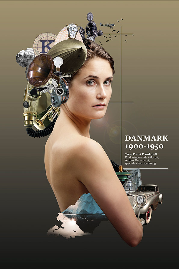
De ville have mig til at indarbejde forskellige elementer, der forklarende festivallens tema og indhold. Årets tema var årene 1900-1950. Så elementerne for dette år plakat hvor meget mere konkrete end sidste år. Dette skyldtes, at vi i år skal beskæftige sig med håndgribelige ting, som retrobiler, krig, våben, fly, rationkuponer og opfindelser af tiden. Meget hurtigt viste de farver og billeder, jeg fandt, hvilken farveholdning jeg ville arbejde i. Så mange af elementerne var mørke og tunge rent farvemæssigt, så jeg besluttede at følge det.
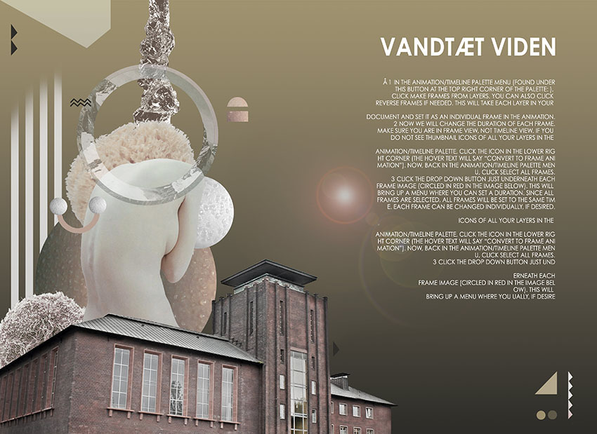
Det var vigtigt for dem at vise en forsker fra universitetet som omdrejningspunkt, fordi festivalen på forskellige måder handler om uddannelse for befolkningen, og de vil have forskerne at være centrum for dette. Så vi havde Tone en kvindelig kønsforsker til at være modellen. Jeg elsker at hendes forskning og hendes køn og udseende er i modsætning til den måde, hun ses på omslaget.
En meget populær “pose” i tyverne og trediverne var, at de unge skuespillerinder skulle afsløre noget af ryggen og ansigtet på samme tid, derfor valgte jeg at få hende til at stå som hun gjorde.
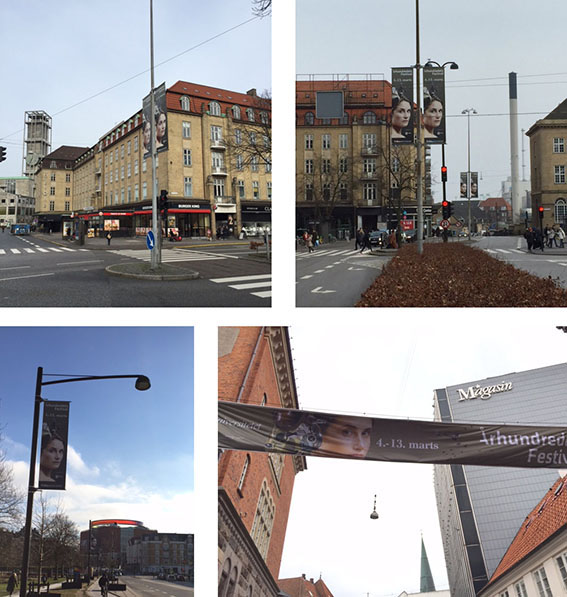
Det sidste vigtige for mig at huske var, at dette kunstværk skulle arbejde på så mange forskellige niveauer. Det skulle være et blikfang og en stærk kommunikator, og samtidig måtte den spredes ud på mange platforme. Som plakater, der strækker sig i størrelse fra A1 til A5, bannere, web, badges, aviser og A4-formatets festivalkatalog.
_
The festival brings together scientists, artists, institutions and creative enthusiasts and merges them through concerts, dinners, lectures, author readings film and exhibitions.
The festival is focused on knowledge, but always with the cultural experience as spice.
They wanted me to incorporate different elements that where explanatory of the festival theme and content. This years theme was the years from 1900 -1950. So the elements for this years poster where much more concrete than last years. This was because we where dealing with tangible things, as retro cars, war, weapons, planes, ration coupons and inventions of the time. Very quickly the colors and pictures I found, decided what color scheme I would be working ind. So many of the elements where dark and heavy colorwise, so I decide to follow that lead.
It was important for them to show a researcher from the university as a focal point, because the festival in different ways is about education for the population and they want the researchers to be the center of this. So we had Tone a female gender researcher be the model. I love that her research and her gender and looks are in contrast to the way she is seen on the cover.
A very popular pose in the twenties and thirties amount the young actresses was to reveal some of the back and the face at the same time, so thats why I chose to have her strike a pose as she did.
The last important thing for me to keep in mind was that this artwork had to work on so many different levels. It had to be an eye catcher and a strong communicator and at the same time it had to be able to be spread out on many platforms. Such as posters ranging in size from A1 to A5, banners, web, badges, newspapers ads, and the A4 sized festival catalogue.


Campaign artwork for Århundredets Festival
The festival brings together scientists, artists, institutions and creative enthusiasts and merges them through concerts, dinners, lectures, author readings film and exhibitions. The festival is focused on knowledge, but always with the cultural experience as spice.
They wanted me to incorporate different elements that where explanatory of the festival theme and content. This years theme was the years from 1900 -1950. So the elements for this years poster where much more concrete than last years. This was because we where dealing with tangible things, as retro cars, war, weapons, planes, ration coupons and inventions of the time. Very quickly the colors and pictures I found, decided what color scheme I would be working ind. So many of the elements where dark and heavy colorwise, so I decide to follow that lead.

It was important for them to show a researcher from the university as a focal point, because the festival in different ways is about education for the population and they want the researchers to be the center of this. So we had Tone a female gender researcher be the model. I love that her research and her gender and looks are in contrast to the way she is seen on the cover.

A very popular pose in the twenties and thirties amount the young actresses was to reveal some of the back and the face at the same time, so thats why I chose to have her strike a pose as she did.
The last important thing for me to keep in mind was that this artwork had to work on so many different levels. It had to be an eye catcher and a strong communicator and at the same time it had to be able to be spread out on many platforms. Such as posters ranging in size from A1 to A5, banners, web, badges, newspapers ads, and the A4 sized festival catalogue.


